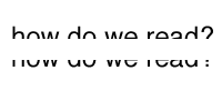
Reading the upper half of a line is far easier than reading the bottom.
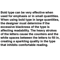
Bold type set in large quantities can inhibit comfortable reading.
 |  |
How We Read
- How we read, and therefore how we design, involves subtle and complex factors based on our eyesight and conditioning.
Caps and lowercase
- The eye scans the upper half of letters and recognizes them almost instinctively
- The lowercase words are more quickly recognizable and more comfortable to read.
Serif and Sans Serif
- Serif typefaces are traditionally considered easier to read.
- San serif fonts may also be easy to read because we have grown accustomed to them.
Regular and Bold
- Bold type can be very effective when used for emphasis or in small quantities. When using bold type in large quantities, the designer must determine if the excessive blackness of the type is affecting readability. The heavy strokes of the letters cause the counters and the white spaces between the letters to fill in, creating a sparkling quality in the type that inhibits comfortable reading.
White on Black vs. Black on White
- Because we are accustomed to reading black type on white paper, we tend to prefer it. However a small block of reversed type can be visually effective.
Condensed and Expanded
- Neither of these is recommended for lengthy reading matter. They are best used for emphasis or display purposes.
|