4. Grids
4. Grids |
|
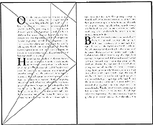
1. For hundreds of years, books printed in Europe were designed with generous margins and Classical proportions. The relationship between the text and white space was determined by geometric formulas. |
|
Classic One-Column Grids | ||
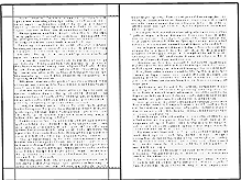
2. Pages filled with text are usually uninviting. Without adequate margins or white space, the type overwhelms the page. |
|
Poorly Executed One-Column Grids | ||
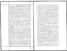
3. The same text as above set in a reduced column width is more inviting to the eye and therefore easier to read. |
|
Improving the One-Column Grid | ||
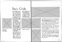
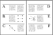
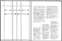
4. Most magazines have grids with two or more columns. The greater the number of columns, the greater the possibilities for organizing the text and illustrations. As long as the text sets well on a given linelength, columns may be any width. The vertical placement of elements such as heads and folios must be carefully determined. |
|
Multiple-Column Grids | ||
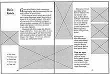
5. Grids may be designed with a greater emphasis on horizontal divisions than on standard vertical columns. These grids tend to be used for technical or special-interest publications. Some publications use more than one grid. Generally, certain margins are shared in these formats to provide visual consistency. |
|
Complex Grids | ||
6. Working without a grid may look easy but requires a great number of design decisions to be effective. |
|
Working Without a Grid |