|  | Anatomy of Type
- Characters.
- The individual letters, punctuation, numerals and other elements that are used when setting type.
- Uppercase.
- Capital letters or caps of the alphabet. The term derives from the early days of handset type when capital letters were stored in the upper section of the typecase. The small letters were kept in the lower portion called lowercase. When abbreviated, capital letters are indicated as Caps, U.C. or simply C.
- Lowercase.
- The small letters of the alphabet, often indicated as lc. When combined with uppercase, they are indicated as U/lc or C/lc.
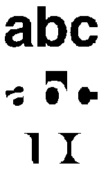
- Baseline.
- An imaginary line upon which the characters seem to be standing.
- Meanline.
- An imaginary line which runs along the top of most loercase letters, such as a, c, e, i, m, n, u, v, w, and x.
- X-height.
- The height of the body, or main element, of the lowercase letterform, which falls between the meanline and the baseline. This measurement is called the x-height because the strokes of the lowercase x end at the baseline and the meanline.
- Ascender.
- The part of some lowercase letters, such as the strokes on the letters b, d, or h, that rises above the meanline.
- Descender.
- The part of some lowercase letters that falls below the baseline, such as the strokes on the letters p, y, and g.
- Counter.
- The space entirely or partially enclosed within a letterform, such as the enclosed "bowl" of the letters b, d, and p.
- Serif and Sans Serif.
- The finishing strokes that project from the main stroke of a letter are called serifs. Serifs originated with the Roman masons, who terminated each stroke of a letter carved into a slab of stone with a serif to enhance its appearance. Not all type has serifs; type having no serifs at all is called sans serif, meaning without serif.
- Small Caps.
- A complete alphabet of caps that are the same size as the body, or x-height, of the lowercase letters: A, B, C, D, E, F, G, etc. Often used in text settings where regular capitals are required but might create unwanted emphasis. Small caps are compatible with lowercase letterforms in the weight of the strokes of the letter. A typical use is for acronyms like NASA or NATO.
- Modern Figures.
- Also called lining figures, these are numbers that resemble caps by being uniform in height: 1, 2, 3, 4, 5, 6, 7, 8, 9, 0. Modern figures are most often used for annual reports, charts, tables, and any application where numbers are meant to stand out or supply critical information. Another feature of modern figures is that they align vertically, making them preferable for setting tables and charts.
- Old Style Figures.
- Also called nonlining figures, these are similar to lowercase characters in the way they vary in size and may have ascenders and descenders: 1, 2, 3, 4, 5, 6, 7, 8, 9, 0. Primarily used when less obtrusive numerals are required, such as within the body of the text. For the same reason, old style are often combined with small caps, for example, PT-109, or 1998 C.E.
- Ligatures.
- Two or more characters joined as a single unit. Ligatures are a typographic refinement that compensates for certain letters that set poorly when combined, such as fi, ff, fl, ffi, ffl..
|