![]() ART
213 Computer Graphics
ART
213 Computer Graphics![]() instructed
by Ralph Larmann
instructed
by Ralph Larmann
Balance Project: Layout Using Rectangles
![]()
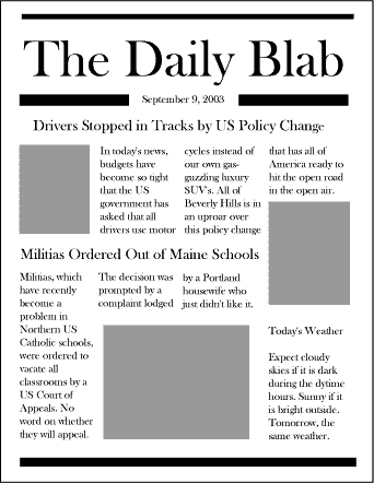
This is an exercise in the use of basic rectangle objects and type tools. Create an 8.5 x 11" page and by using only text and rectangles, layout a mock newspaper with headlines. Use at least three gray rectangles to indicate where photographs will be placed. Make up your own stories or just use "greeked" text to fill.
Remember that you can drag the Text tool to create text blocks. These can be resized just like rectangle tools.
By selecting an object or text area and using the arrow keys you can more carefully place rectangles an align them in your design.
A good newspaper-like font to use is Baskerville Old Face or other serif fonts. Times and Times New Roman are also serif fonts. Sans serif fonts are good to create contrast and to accentuate clean lines in a design.
Gutters
Notice how the pictures and headlines are used? They are placed in such a way that there is no "gutter" in the page layout. A gutter is a white area between areas of text or pictures that runs from one side to the other or from top to bottom without interruption. Good design invites a viewer to move easily through the the space, without being influenced to go off the page. A gutter tends to make a reader follow the white area off the page and, consequently the reader misses the information posted there.
![]()
![]()
![]()
![]()